 |
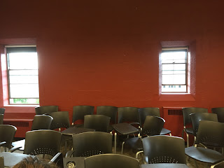
| Varying window sizes |
I chose to go to Burton Memorial Tower. I have always been fascinated by
this building because the original designs for the tower were actually done by
Eliel Saarinen, the same architect who designed my high school. His designs
were slightly altered and then used by Detroit architect Albert Kahn to
construct the tower that stands today. I entered the room in the door closest
to the front of the room--there are actually 3 identical wooden doors on the
same wall of the room. The first thing I noticed when I walked in was the piano
in the front of the room, so I assume it must be a music classroom. There are
about 60 desks in the room all facing front—walking into the empty room, they
looked almost like soldiers standing to attention. The space feels larger
because it is a long rectangle shape with (relatively) tall ceilings. Looking
out of the windows, the room is at almost exact level with the tops of the
trees and there is something uplifting about viewing the campus at this level.
I noticed there were blackout shades on every single window. I put them
all down and turned off the lights and it was almost completely dark—ideal for
video screening. There is also a projector screen, two big speakers, a
small podium, stereo, VHS, DVD player and of course, the piano.
In my opinion, this room was having an identity
crisis. The desks and harshness say large lecture hall, but the piano and
chalkboards with music lines say otherwise. I am guessing it is a music theory
room, but it definitely does not feel like a room for collaborative learning.
However, I have never taken a music course here so I guess I wouldn’t really
know. From what I imagined the music school to look like, this is not it.


No comments:
Post a Comment